Executive Summary
Crew Watch and Crew Recovery are mission-critical tools for airline crew operations, especially during IROPs, but outdated interfaces and fragmented workflows hindered disruption response. By leading user research, co-creation, and iterative design, I helped modernize both tools—streamlining alert categories, clarifying workflows, and introducing customization—to improve usability, speed up response times, and build user confidence, all while designing for low-light operational settings.
Product Brief
Crew Watch and Crew Recovery are internal tools used daily by airline Crew Trackers and Coordinators. Crew Watch delivers real-time crew status and alert monitoring, while Crew Recovery facilitates the reassignments necessary when disruptions occur. These tools play a mission-critical role in ensuring timely, compliant crew operations—especially during irregular operations (IROPs).
Problem Statement
Crew Trackers and Coordinators rely on outdated, siloed systems that create friction during disruption response. This is a problem because it slows users down, increases error risk, and jeopardizes regulatory compliance.
The Goal
Redesign Crew Watch and Crew Recovery to unify monitoring and recovery workflows into a cohesive, user-friendly interface—eliminating friction, boosting accuracy, and empowering users to respond to disruptions with speed and confidence.
Responsibilities
I was responsible for:
✔ Conducted user research via shadowing, interviews, and surveys
✔ Facilitated design thinking workshops with cross-functional stakeholders
✔ Created wireframes, prototypes, and high-fidelity UIs
✔ Collaborated with product, legal, HR, and engineering to balance usability, compliance, and feasibility
Tools Used
🖌 Figma – Wireframing and high-fidelity mockups.
🧠 FigJam – Ideation sessions and affinity clustering.
📩 Comply365 – Sending compliant user surveys.
🧪 Maze – Conducting usability testing and gathering feedback.
🧱 AA Aileron Design System – Ensuring visual and interaction consistency.
Research & Analysis
Shifting the Mindset
At the start of the project, many IT and Business stakeholders had never worked with a UX designer and expected a simple wireframe delivery. However, I proposed a structured research plan to dig deeper into user behavior and workflow friction. As insights began to surface—from shadowing frontline users to collecting anonymized survey data—those same stakeholders became advocates for a user-centered process. What started as a request for UI design evolved into a broader exploration of user needs, leading to discoveries that reshaped how the organization viewed this tool’s potential.
Shadowing the Front Lines
Joined live shifts with Crew Trackers and observed Crew Coordinator training to understand their day-to-day workflows, pressure points, and how they adapt in real-time during IROPs.

Behavioral Personas
With cross-departmental approval, I deployed a survey through Comply365 and paired responses with 1:1 interviews to develop personas focused solely on user behavior. The survey went out to 149 total users with 63% participation. Out of the 95 participants, 59 were Crew Trackers and 36 were Crew Coordinators. Stripping out demographics minimized bias and helped us anchor design around actual user needs. While Crew Trackers and Coordinators each brought varying years of experience and backgrounds, a surprising insight emerged within each group:
Crew Trackers, despite differences, exhibited consistent behavioral patterns—leading to a unified Tracker persona. The same was true for Crew Coordinators. This behavioral alignment within roles gave us confidence that our solutions would meaningfully address shared challenges across both user types.
Crew Tracker – Key Points:
- Alert Overload is a Major Obstacle: Struggle with false or outdated alerts that affect prioritization and focus.
- Desire for Growth and Recognition: Motivated by doing well, learning, and being recognized—tools can support this growth.
- They Enjoy Problem-Solving & Staying Ahead: Thrive on catching issues early and solving puzzles, which can be enhanced through better investigative workflows.
Crew Coordinator – Key Points:
- Workflow Bottlenecks from System Limitations: Slowed down by overlapping alerts, redundant tools, and system crashes, leading to frustration and inefficiency.
- Task Completion & Operational Smoothness Matter Most: Motivated by resolving issues quickly and keeping the operation running without disruptions.
- Team Coordination is Central to Success: Act as a key relay between departments, prioritizing efficiency and minimal delay.

User Journey Map
Mapped the workflows for clearing alerts and running recovery to identify critical breakdowns. Trackers struggled with false alerts and cluttered screens; Coordinators lacked visibility and confidence in system-generated recovery solutions.

Heuristic Evaluation Summary
Audited the interface using Nielsen’s 10 Heuristics and here’s some of the top issues I found:
❌ Visibility of system status: Alert groups lacked clarity
❌ Match between system and real world: Hidden crew recovery behind puzzle icon
❌ User control: No copy/paste
❌ Help/documentation: “Help” button was broken

Ideation & Wireframing
Research surfaced deeper issues beyond UI—namely, broken workflows and lack of trust in the system. Stakeholders initially expected simple wireframes, but as research insights emerged, they embraced a broader UX approach. I led a design thinking workshop to shift the focus from just interface tweaks to solving root problems. Together, we brainstormed “How Might We” statements and used dot voting to prioritize the top opportunities, which shaped how we would think about solving the problems:
🏆 CW: “How might we help users customize and prioritize alerts for their individual needs?”
🏆 CR: “How might we build user trust in automated recovery solutions by surfacing deeper insight?”

User-Led Prioritization
With HMW statements established, I followed that up by leading a brainstorming and affinity clustering design thinking session with users, where ideas naturally centered around alert time management, access to historical comment documentation, and clearer organization. These themes reinforced our earlier findings and helped validate our problem framing before advancing to solution concepts.

Rethinking Alert Groups
Worked with users to restructure 48 existing alert groups into just 23 clear, actionable categories—making alert triage far more intuitive. After refining the groupings, we also brainstormed how users would ideally interact with them. Key ideas included:
🔍 Ability to select and view one alert group at a time
⚡ Prioritization of alerts based on urgency or relevance
🧩 Advanced sorting options to organize alerts efficiently

Co-Sketching the Future
Facilitated a ‘Concept Sketching’ session with five users from the IOC floor—no small feat given the challenge of pulling them away during live operations. The session lasted an hour and focused on generating quick, tangible ideas rooted in our earlier ‘How Might We’ statements. Despite their limited time, users eagerly sketched concepts reflecting their ideal experiences with Crew Watch and Crew Recovery.
Common themes included more intuitive task flows, simplified flight selection, and clearer visual hierarchies. I used their sketches to inform a consolidated UI concept that carried their ideas forward into a low-fidelity wireframe. This transition from divergent thinking to early design ensured that user perspectives directly shaped the first iteration of the redesigned tools.


Lo-Fi Usability Testing
To validate early design concepts, I tested lo-fi wireframes with 10 Crew Coordinators—each representing a key stakeholder in both alert triage and crew recovery execution. All participants successfully completed the assigned workflows, resulting in a 100% task completion success rate.
Their responses confirmed we were moving in the right direction:
“The experience isn’t complicated. Seeing disrupted crews clearly is a big improvement.”
“The new process is simpler and more to the point.”
“I like that the screen isn’t cluttered—I just want the flights.”
This round of testing gave the team confidence that even in low-fidelity, the redesign was already solving major pain points around clarity, usability, and task prioritization.

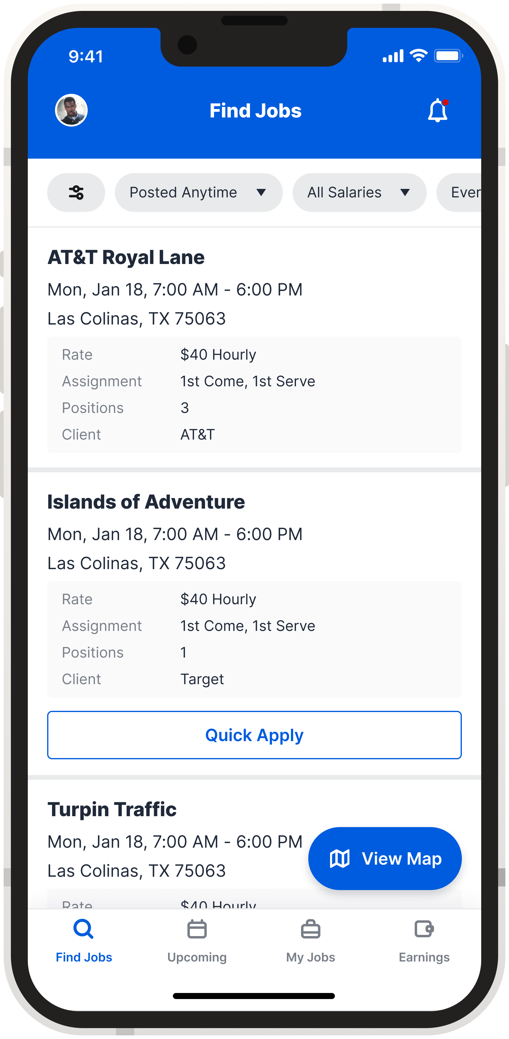
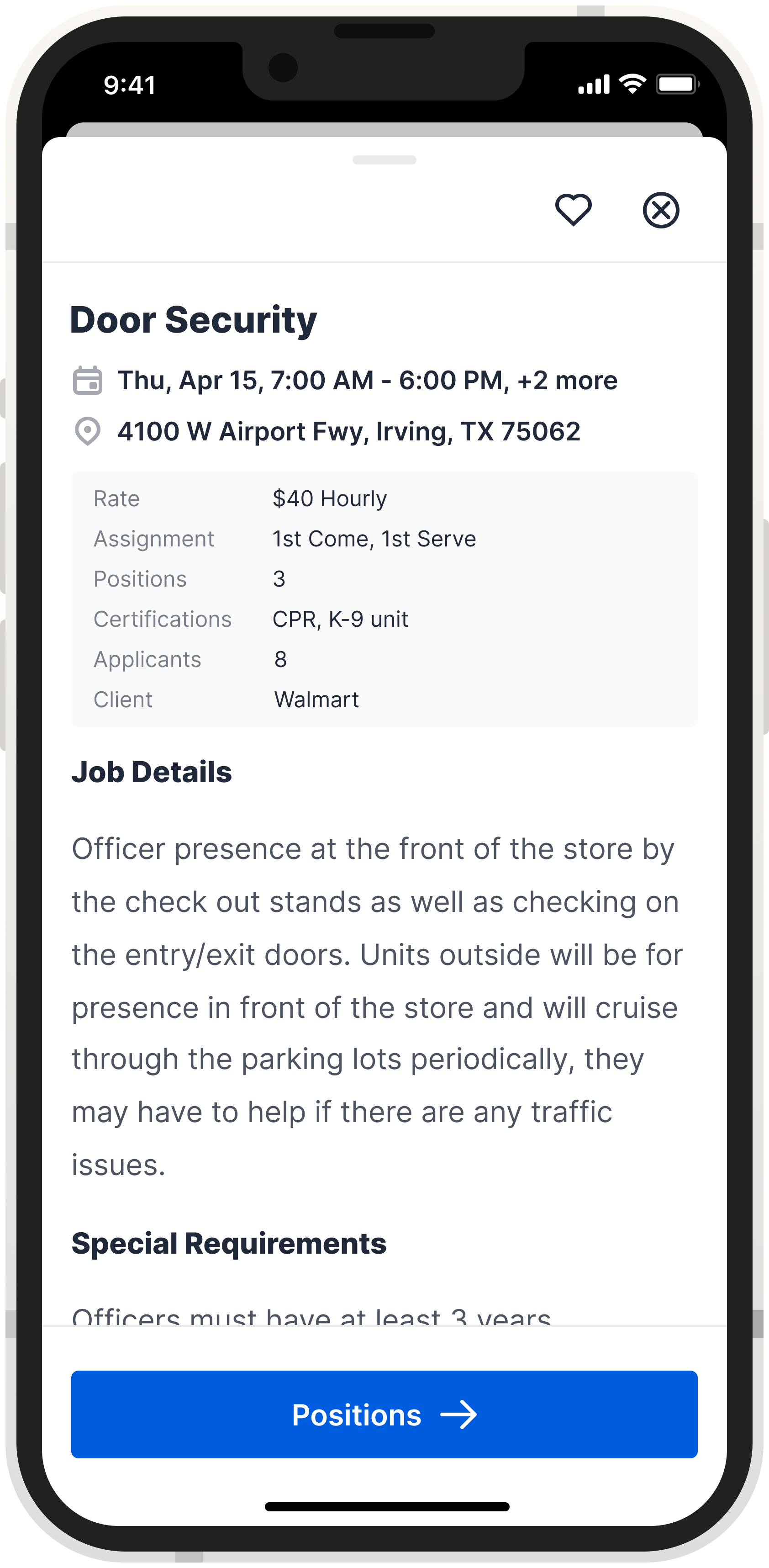
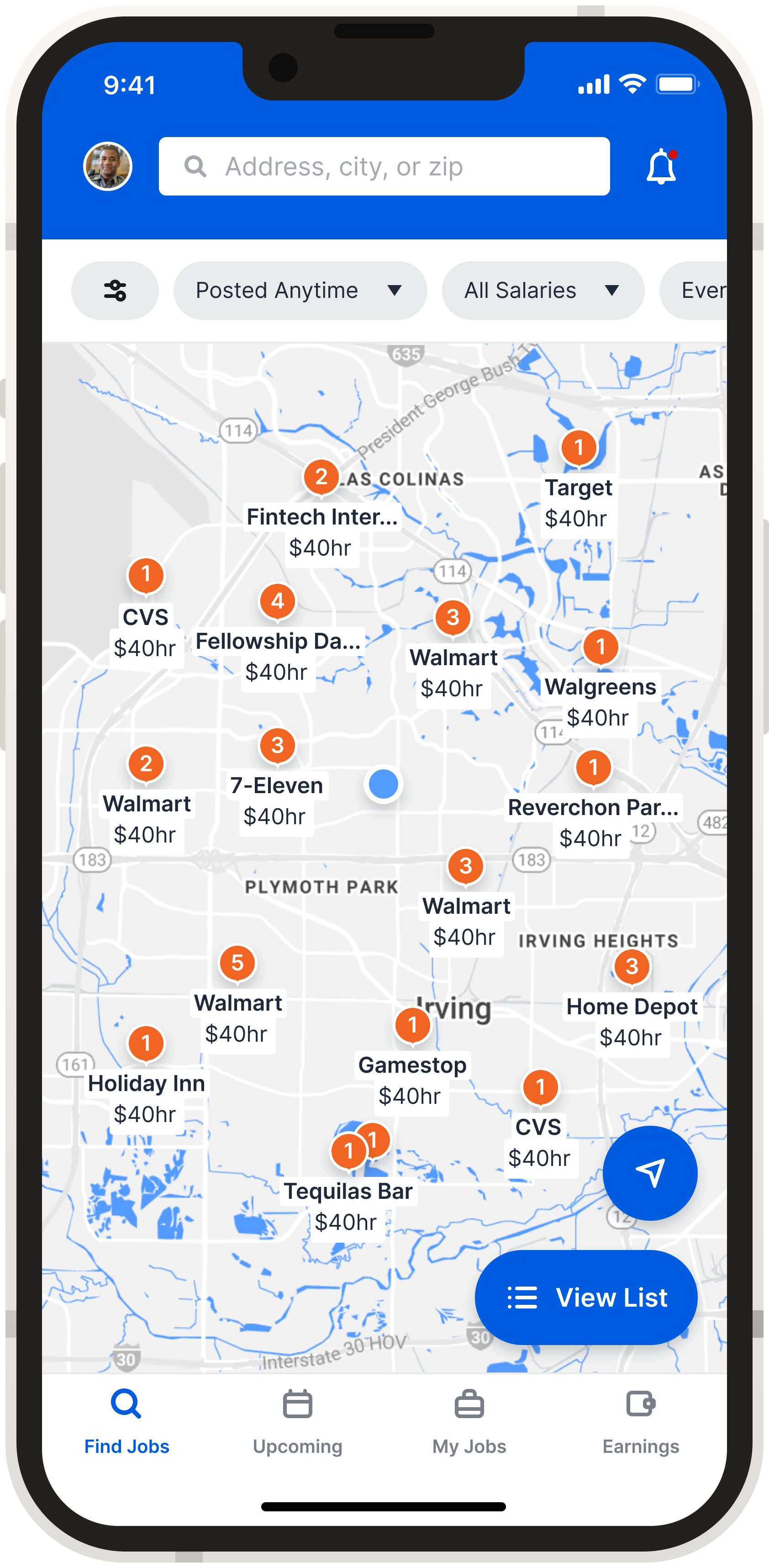
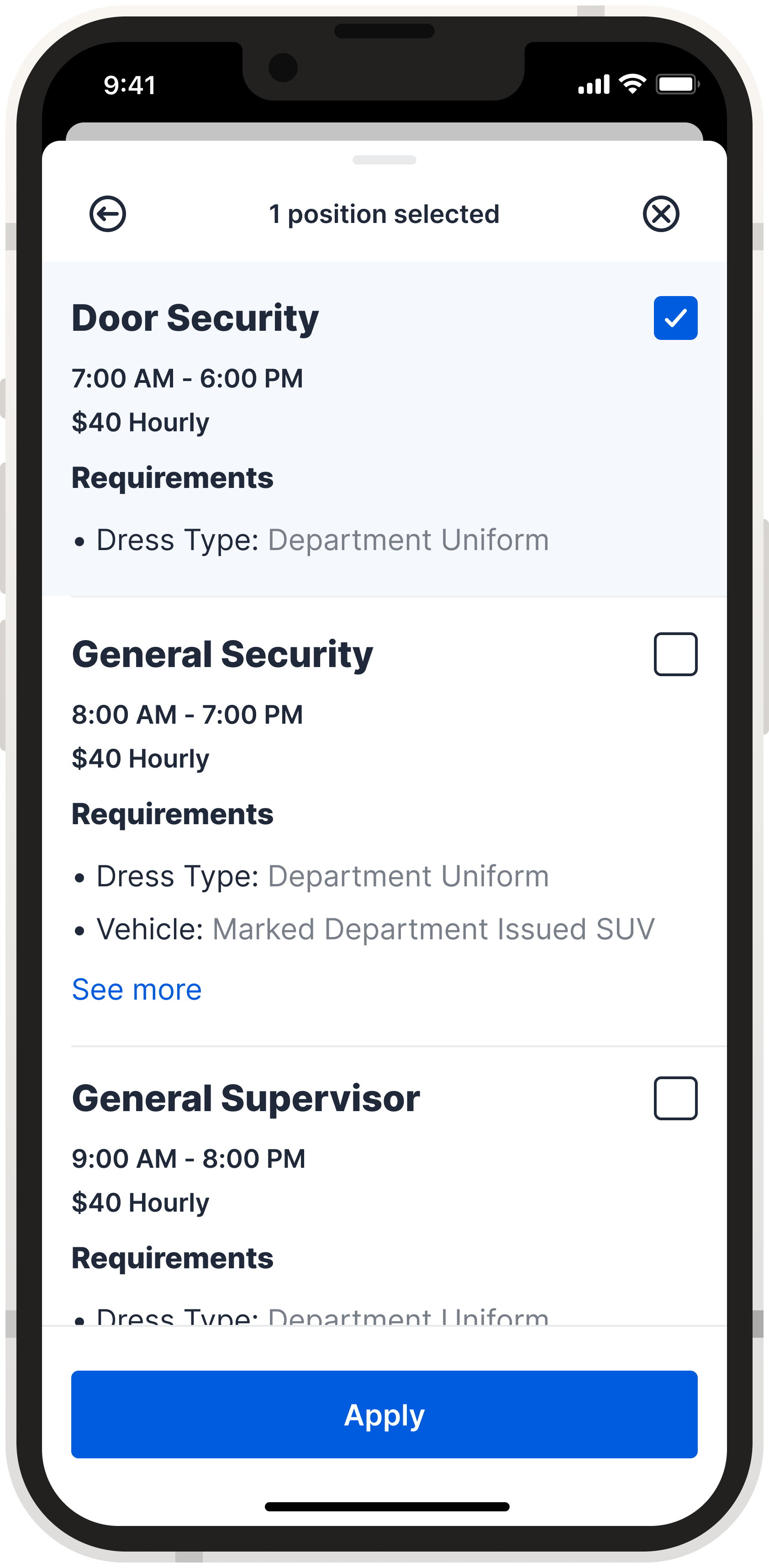
Final Design
Building on research, sketching, and iterative testing, I restructured the information architecture to align with real user workflows, setting the stage for a streamlined, focused interface. I then designed the high-fidelity UI.
We introduced dark mode to reduce eye strain in the IOC’s low-light environment, a key user consideration. The final interface also featured customizable columns, simplified navigation, less screen clutter, and clearly defined alert actions to support better prioritization. By consolidating key workflows into one tool, we eliminated the need for users to toggle between outdated systems.
The Crew Recovery flow was redesigned to be more intuitive—from flight selection to reviewing and running solutions—helping users move quickly and confidently during disruptions. At the same time, backend stories were written to improve the solver logic and reduce false alerts, resulting in more accurate outcomes and fewer unnecessary deadheads in the pairings.
📈 Post-testing heatmaps guided subtle UI refinements, like repositioned CTAs, cleaner alert groupings, and improved inline system feedback—all confirming we were solving for clarity, control, and confidence.
Lessions Learned
What This Project Taught Me
🔹 Navigating compliance with care: Legal and HR sign-offs required extra planning, but ultimately reinforced our research’s integrity and strengthened cross-team trust.
🔹 Co-creating under pressure: Involving users from the IOC—despite operational constraints—led to some of the most valuable insights. Their input directly shaped early sketches and wireframes.
In summary, grounding this project in user behavior, validating through testing, and aligning backend logic with frontend usability created a solution that’s both intuitive and impactful in high-pressure environments.