Executive Summary
RollKall officers struggled to find relevant off-duty jobs due to poor filtering and unclear job details. Through user research, heuristic evaluation, and iterative design, I improved navigation, added advanced filters, and enhanced the application process. Usability testing showed an 89% success rate, with officers finding jobs faster and with greater confidence.
Product Brief
RollKall’s mobile app helps officers easily find and apply for off-duty jobs in their area.
Problem Statement
Officers struggle to find off-duty jobs that align with their preferences. Many have expressed frustration over the lack of filtering options, leading to wasted time scrolling through an overwhelming number of job listings. This lack of personalization creates a poor user experience and reduces efficiency in securing off-duty work.
The Goal
Design a seamless and intuitive experience that enables officers to quickly find, filter, and apply for off-duty jobs.
Responsibilities
I was responsible for:
✔ User Research: Conducted surveys and interviews to gather insights and understand user needs.
✔ Journey Mapping & Wireframing: Created user journey maps and low-fidelity wireframes to map out key interactions.
✔ Design System: Developed a scalable design system to ensure visual consistency across the product.
✔ High-Fidelity Design & Prototyping: Built detailed mockups and interactive prototypes to showcase user flows.
✔ Usability Testing: Led testing sessions to validate design decisions and refine the experience.
Tools Used
🖌 Figma – Wireframing and high-fidelity mockups.
📊 SurveyMonkey – Collecting real user insights.
👣 FlowMapp – Visualizing user journeys.
Research & Analysis
Understanding the User & the Root Problem
When users first voiced concerns, they primarily stated they wanted to see more jobs in a single view because they felt overwhelmed sorting through listings. At first glance, this suggested a need for displaying more jobs per page.
However, after conducting surveys and user interviews, I discovered that the real issue wasn’t visibility—it was inefficiency. Officers weren’t struggling to see jobs; they were struggling to find the right jobs quickly due to:
- Limited filtering options, forcing them to scroll through irrelevant listings.
- Confusing navigation, making it harder to refine searches.
- Lack of a quick-apply feature, increasing frustration and time spent per job search.
This deeper insight shifted my focus from increasing job visibility to improving job discoverability and filtering, ensuring officers could easily find jobs tailored to their needs.
Personas
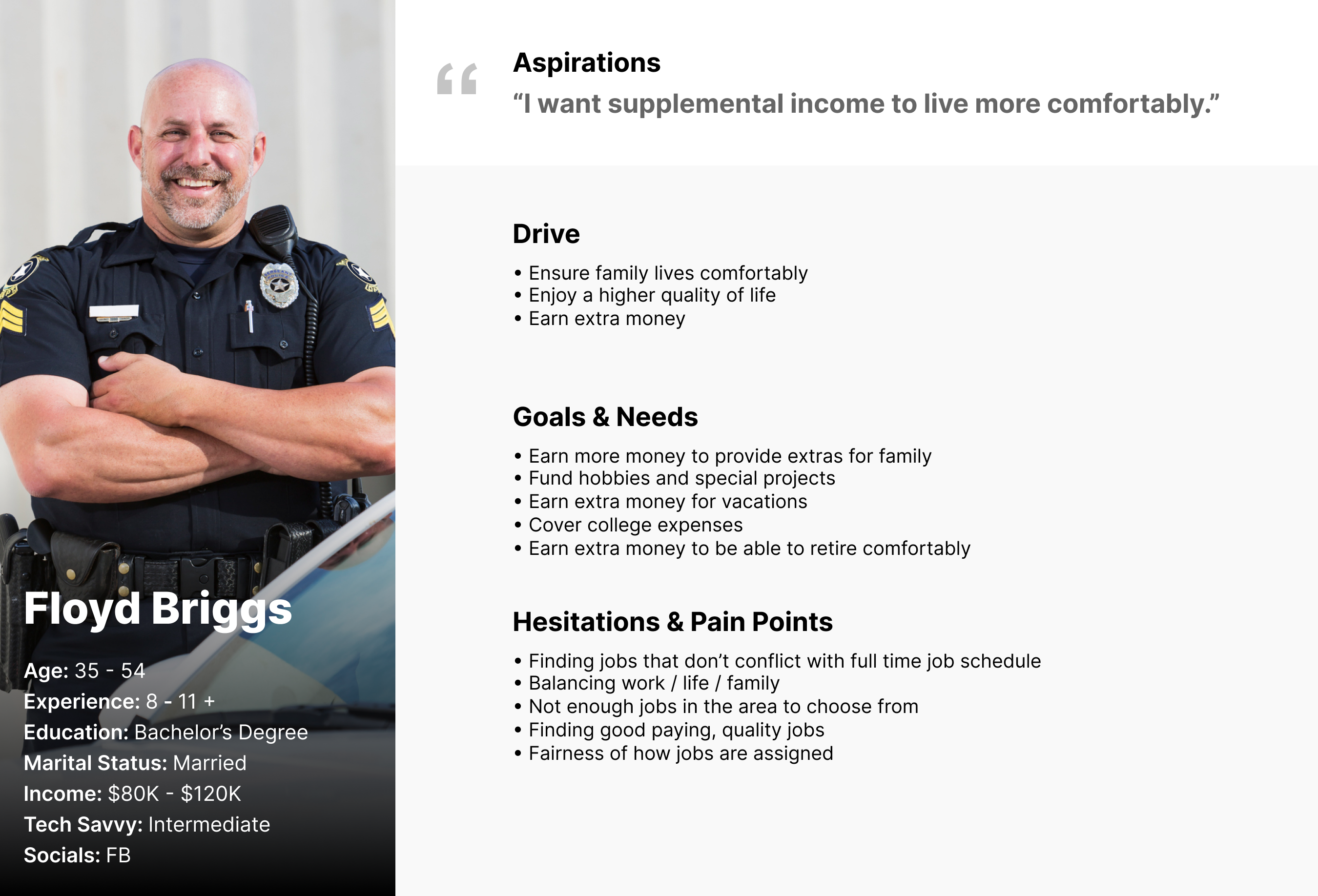
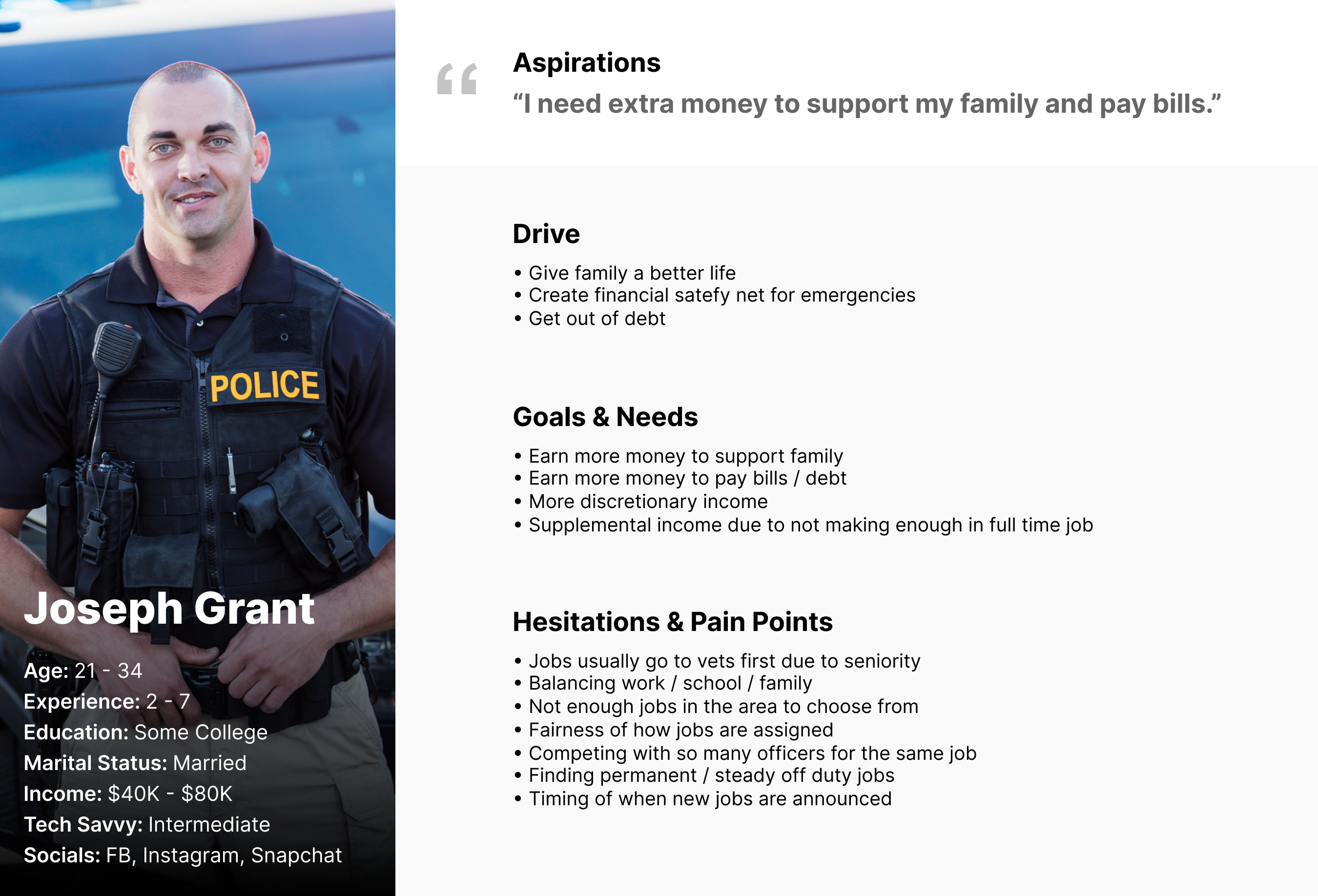
Through research, I identified two key user groups:
1️⃣ Veteran Officers – Looking for flexible off-duty work to supplement their income.
2️⃣ Junior Officers – Actively seeking off-duty jobs as a secondary source of income to make ends meet.
User Journey Map
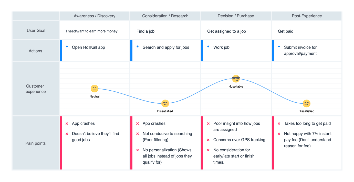
To better understand the pain points officers experience when searching, applying, and working off-duty jobs, I mapped out their current user journey. This process revealed key challenges:
-
Ineffective filtering options, making it difficult to find relevant jobs.
-
Lack of clarity in job assignments, leading to confusion about the hiring process.
-
Misconceptions about payment processing, causing frustration among officers.
By identifying these issues early, I was able to target the most critical areas for improvement.
Heuristic Evaluation Summary
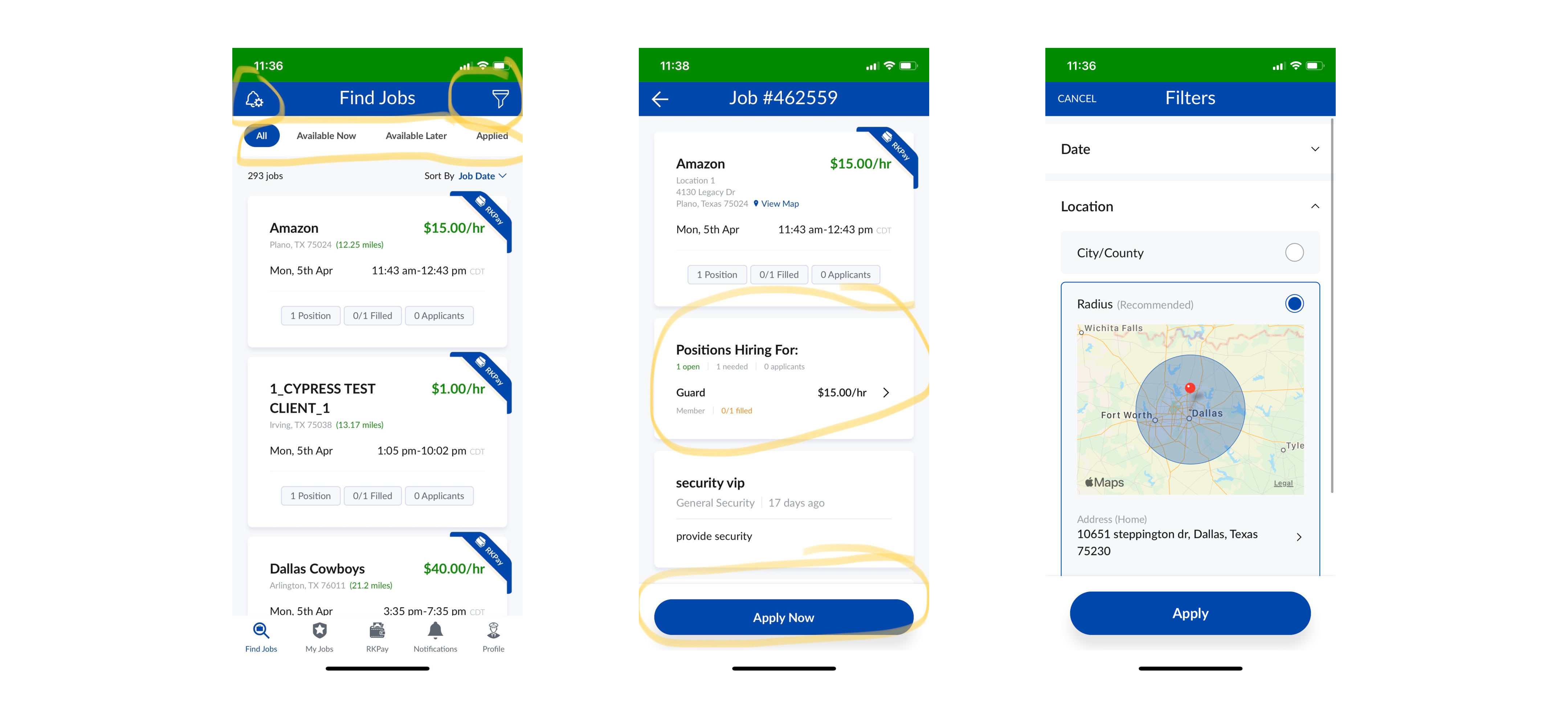
Before diving into solutions, I conducted a heuristic evaluation of the existing app to assess usability. This revealed several key issues:
- UI inconsistencies, leading to a disjointed experience.
- Poor error prevention, making it easy for users to make mistakes.
- Confusing navigation, reducing efficiency in job searching.
- Lack of discoverability, causing important features to go unnoticed.
These insights provided a strong foundation for redesigning the app to be more user-friendly and efficient.
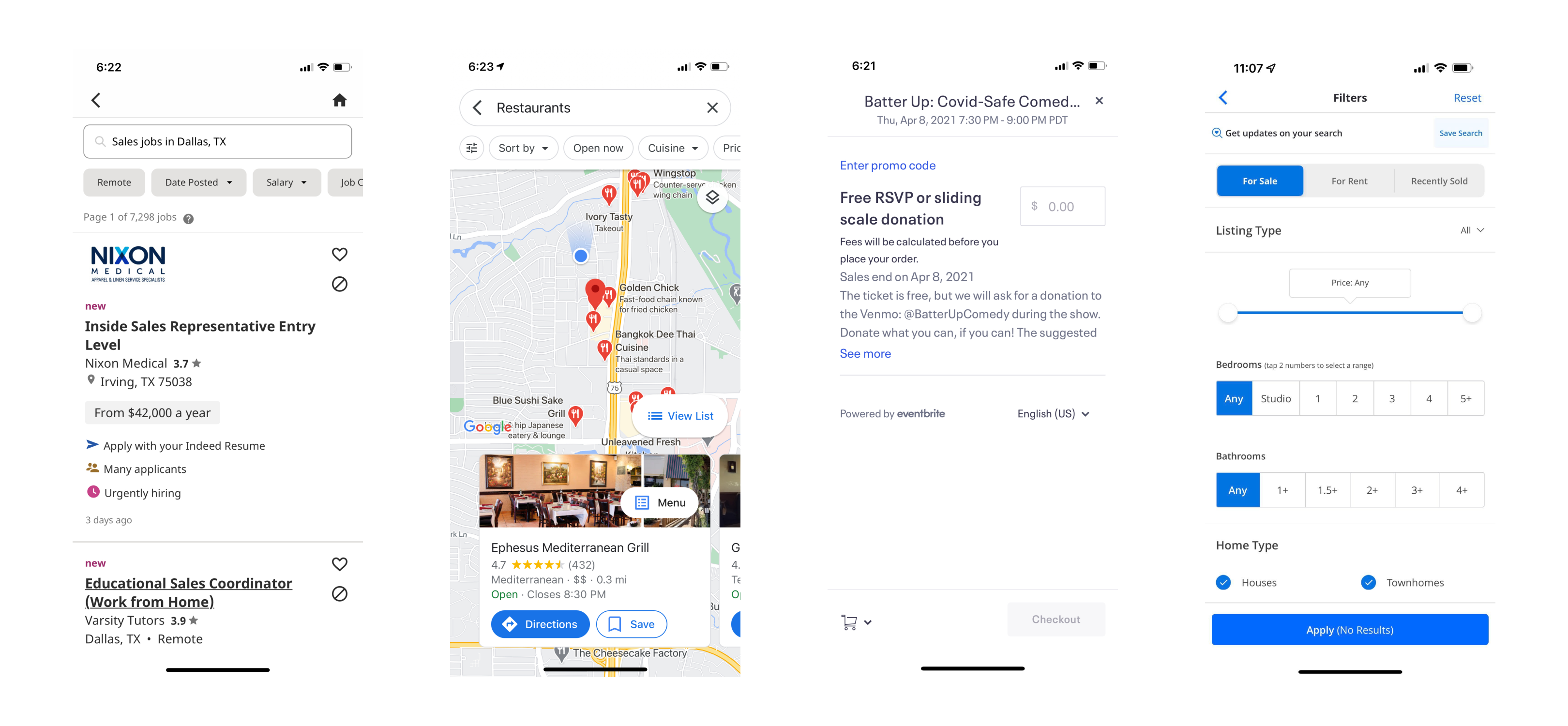
Competitive Analysis & Lightning Demos
To explore best-in-class solutions, I researched apps that excel in:
✔ Advanced filtering systems to help users refine searches efficiently.
✔ User-friendly location-based job discovery for quick browsing.
✔ Effective content hierarchy to improve readability and engagement.
This research helped guide the ideation process by identifying successful design patterns that could be adapted for RollKall.
Ideation & Wireframing
Using insights from research, I kicked off the ideation phase to generate potential solutions. I created low-fidelity wireframes focusing on:
- Improved filtering controls (e.g., job type, location, pay).
- Clearer job assignment process with real-time updates.
- More transparent payment tracking to set clear expectations.
These wireframes laid the groundwork for prototyping and testing.

Design & Testing
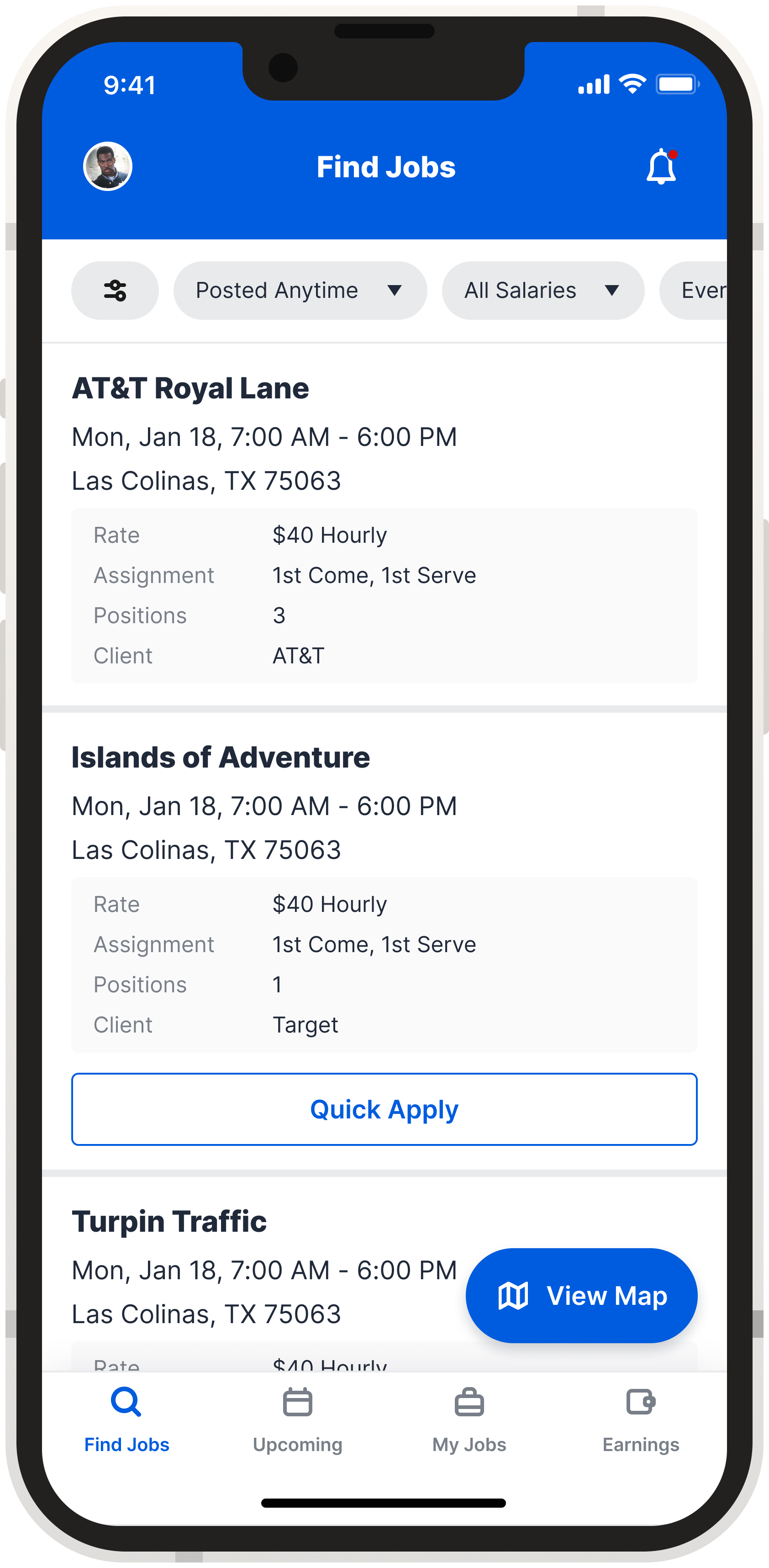
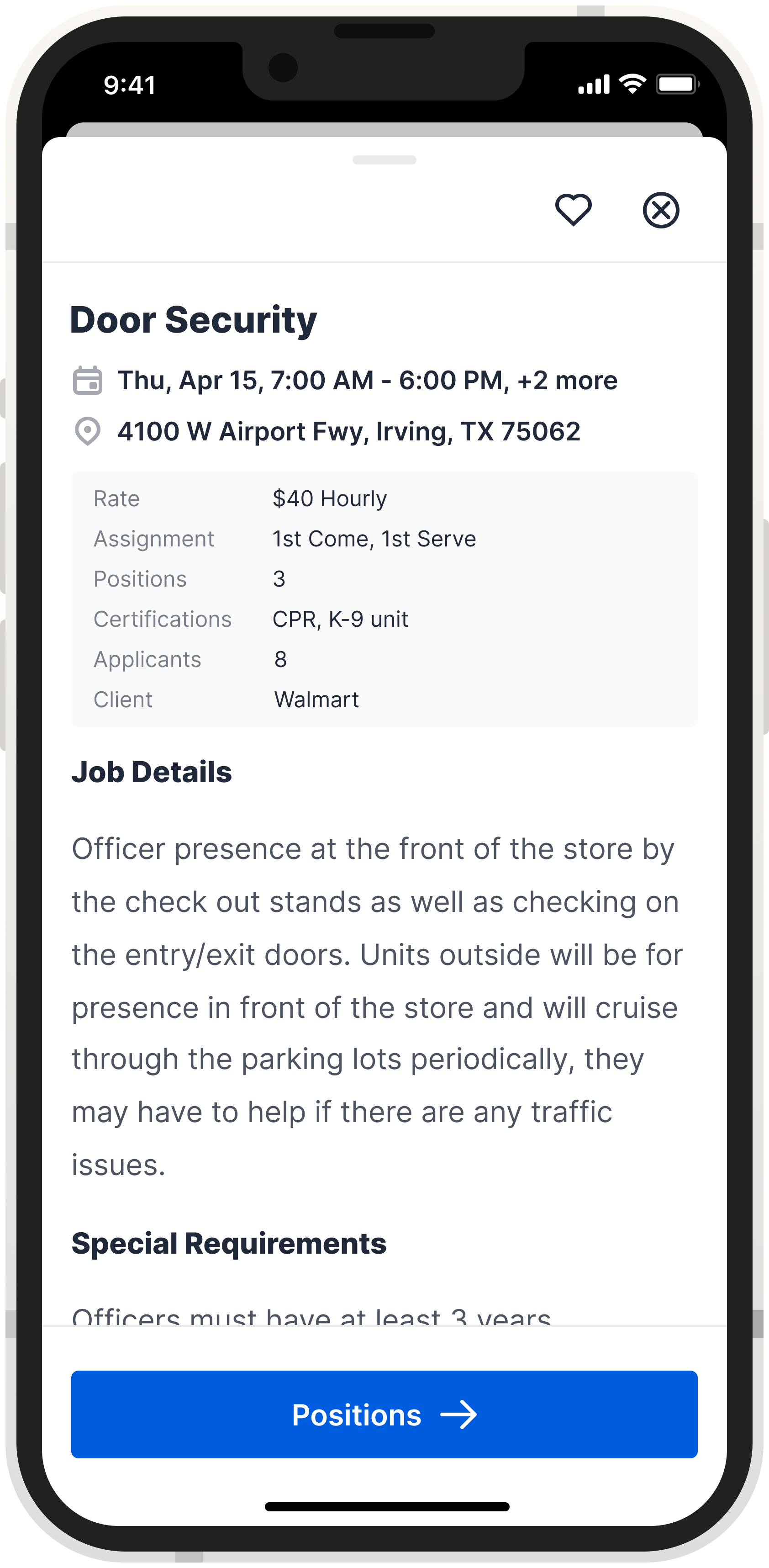
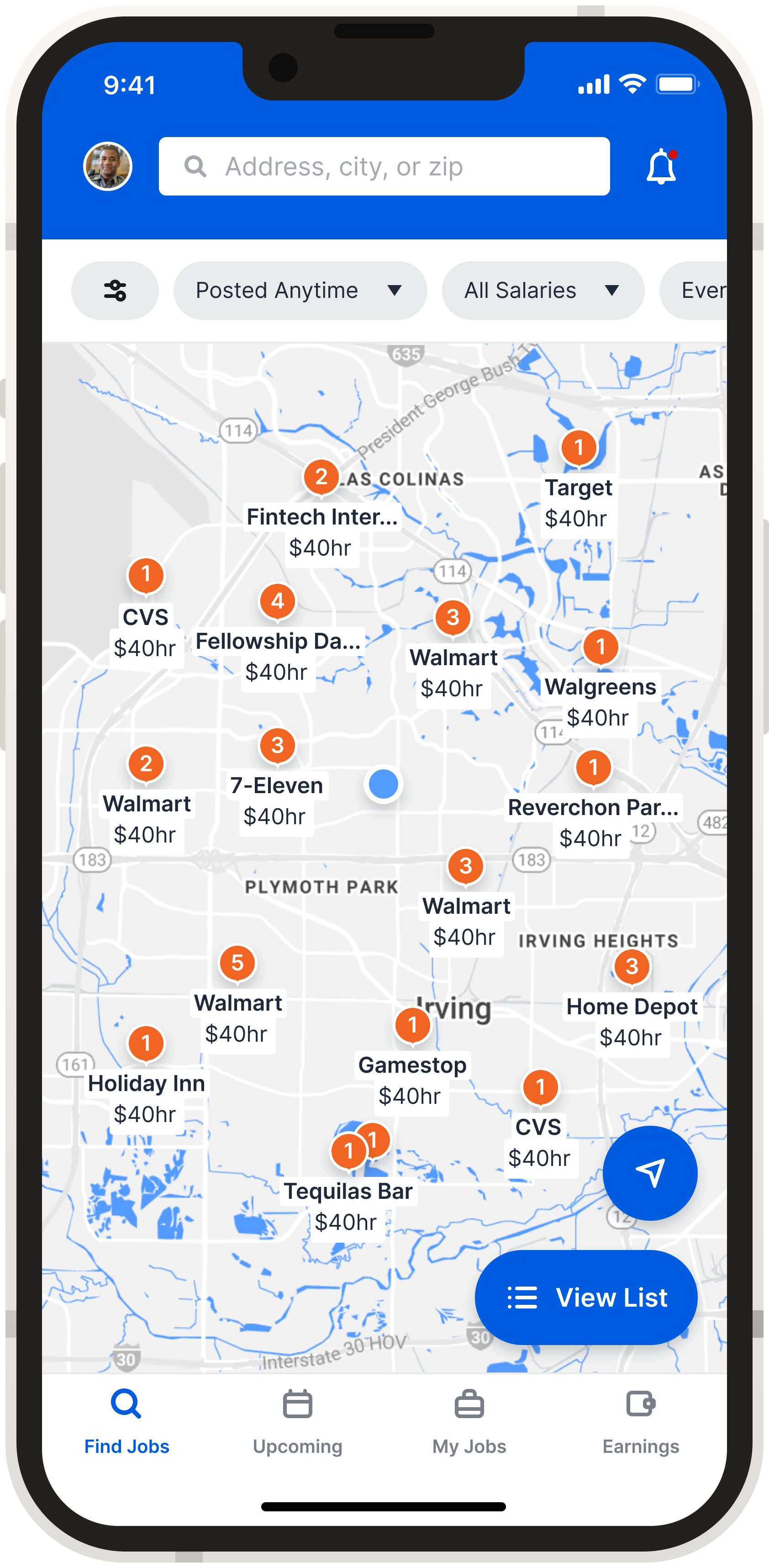
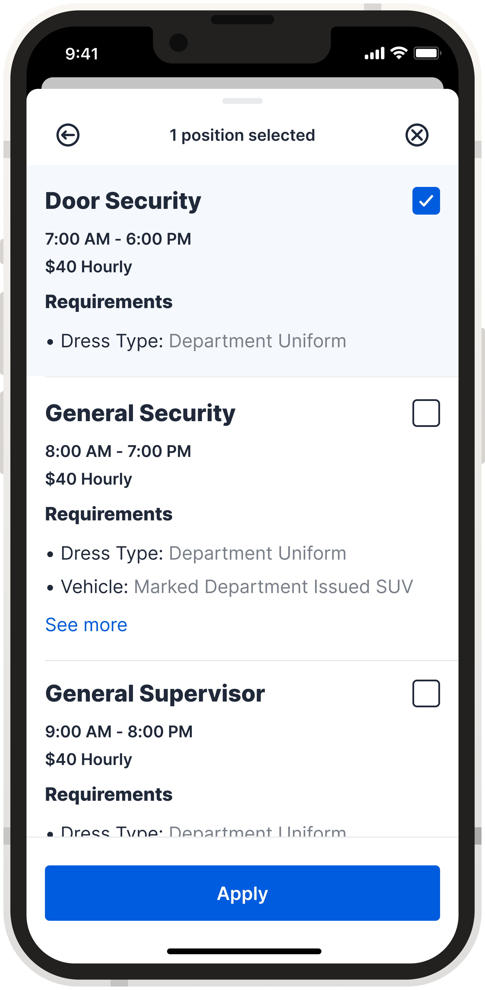
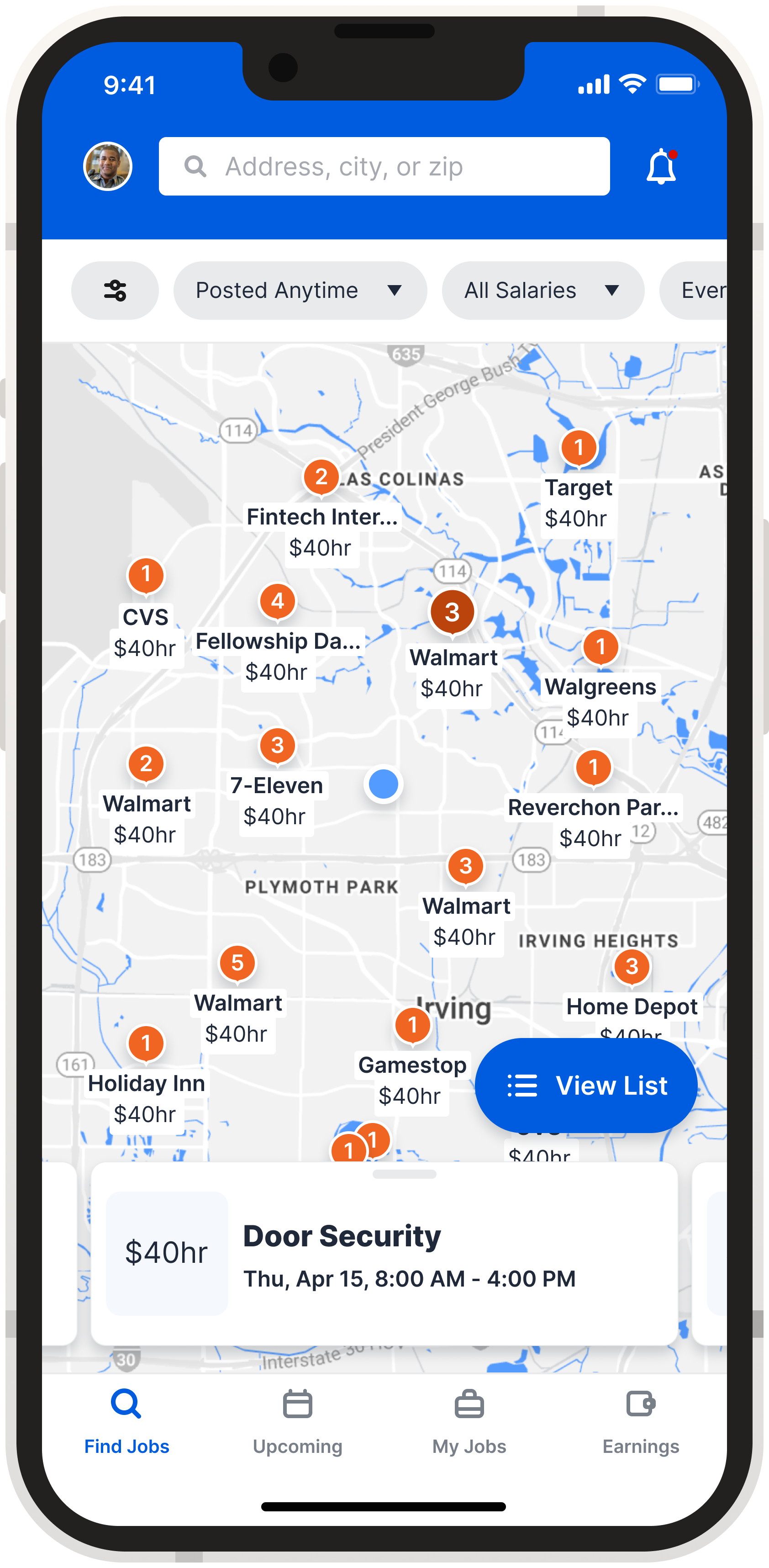
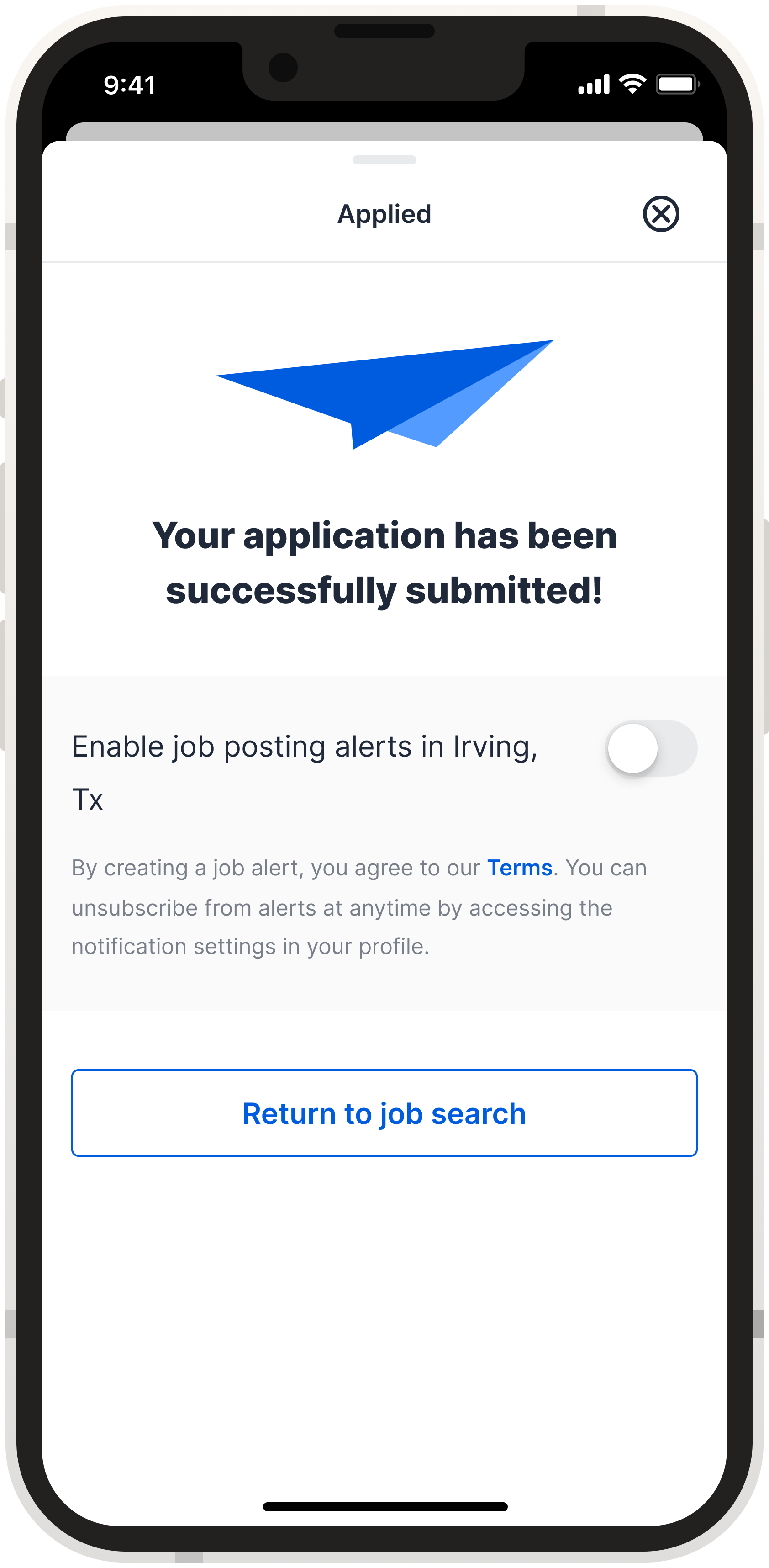
I created high-fidelity prototypes and conducted usability testing to evaluate and refine the design improvements.
Key Results:
✅ 89% success rate in finding and applying for jobs.
❌ 11% failure rate due to poor discoverability of the list/map view toggle.
To resolve this issue, I added a label next to the icon button, which significantly improved visibility and made the toggle more intuitive for users.
Lessions Learned
What This Project Taught Me
🔹 Designing for user priorities: Officers were primarily motivated by income opportunities, not community engagement. We prioritized speed, clarity, and ease of access—which led to higher engagement and application rates.
🔹 Designing for complexity and flexibility: With each LEA having unique requirements, the product had to be highly adaptable. Building in system flexibility ensured a consistent experience without adding friction.
In summary, keeping user motivations at the core and building for operational nuance were essential in creating a solution that balanced usability with scalability.